 By Mithil Jain
In this guide, we will cover everything about the CSS Flexbox Module. This guide describes how flexbox works and all the properties of flexbox. It is divided into 2 parts as a flex container – Parent and flex items – Child. Firstly, we need to understand what Flexbox is and why we should use it.
What is Flexbox ?
CSS Flexbox is a one-dimensional display method to display the flex items in rows and columns. It helps to arrange, shrink, add space in a specified manner. In essence, it provides control over the items and their dimensional appearance. It is a module and not a property to use directly; there is a parent element (flex container) and the child element the flex items.
Why Flexbox ?
CSS Flexbox makes it easier to design a layout structure without using float or positioning. It is nice to use both individually but each has its limitations and sometimes is very annoying to use. However, Flexbox is very useful for some cases, few of them mentioned below:
- Both Horizontal and vertical alignment of a block inside a div
- Giving equal spaces between the multiple div
- Adjusting height/width dynamically based on the height/width of its parent element
- Aligning the elements to the baseline, center line or the top line of the division
Although these are the major use cases, flexbox has many other possibilities. Now that we know where we can use flexbox, let’s dive into different properties of the flexbox module.
Properties of CSS Flexbox Container (parent component)
Before adding any property to a block, we need to convert the block into flexbox. For this purpose, we add display: flex property to the parent element.
Properties for the Flexbox Container
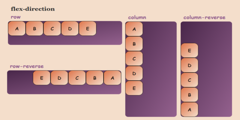
flex-direction:
This property specifies in which direction the flex items should be placed. The Default value is row. Likewise, flex-items can have horizontal rows or vertical columns.
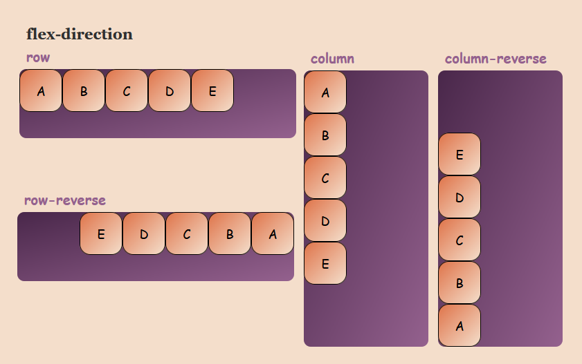
flex-direction: row | row-reverse | column | column-reverse;- flex-direction: row – This is the default value and set the flex-items from left to right
- flex-direction: row-reverse – This sets the flex-items in a row from right to left
- flex-direction: column – This sets the flex-items in a column from top to bottom
- flex-direction: column-reverse – This sets the flex-items in a column from top to bottom
flex-direction also accepts the global value inherit, initial and unset
flex-wrap:
This property allows you to change the wrap property of the flex items as by default the multiple flex fits all the items in the single row, i.e. you can allow the items to wrap and display the items in multiple lines.
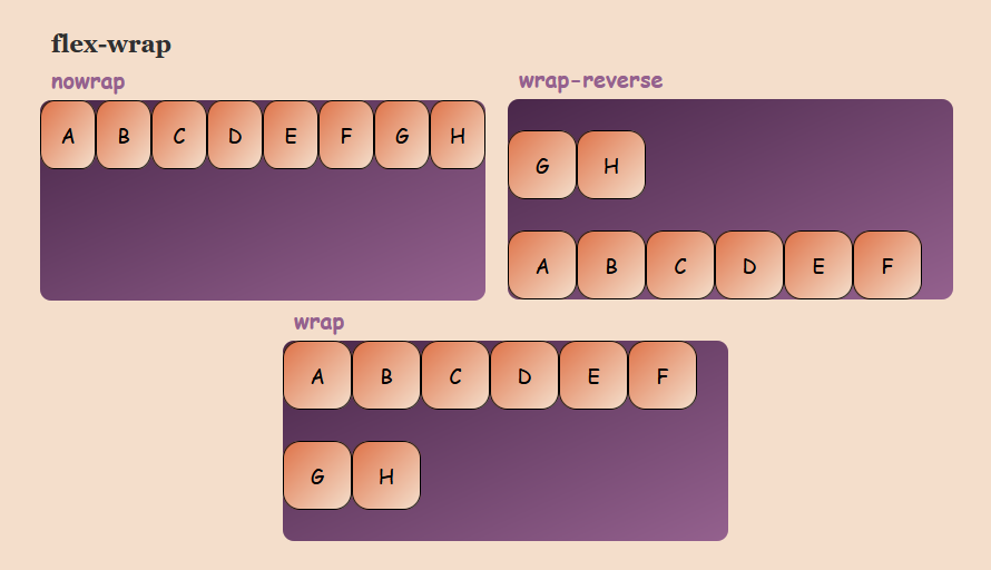
flex-wrap: nowrap | wrap | wrap-reverse;- flex-wrap: nowrap – This is the default value and displays all the flex-items in the single row. However, it may sometimes cause to overflow the container
- flex-wrap: wrap – This will allow to wrap the flex-items into multiple lines from top to bottom
- flex-wrap: wrap-reverse – This will wrap the flex-items into multiple lines from bottom to top
flex-wrap also accepts the global values inherit, initial and unset
justify-content:
This property is used to align the flex items and specify the spacing distance between and around the flex items.
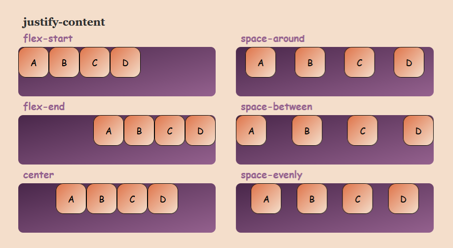
justify-content: flex-start | flex-end | center | space-around | space-between | space-evenly;- justify-content: flex-start – This is the default value and aligns all the flex-items at the beginning of the container
- justify-content: flex-end – This property packs and align all the flex-items at the end of the container
- justify-content: center – This packs and aligns all the flex-items at the center of the container by having equal space on the left and right inside of the container
- justify-content: space-around – This leaves equal space around (left and right) of each flex-items. e.g. space around 2 flex-items will be 2 units and space between the start and end of the flex items and the edge will be 1 units
- justify-content: space-between – This leaves equal space between the flex-items and no space between the first flex-item and last flex-item with respect to the edge
- justify-content: space-evenly – flex-items are evenly distributed in the flex container with evenly space in between
align-items:
This property is used to align the items vertically inside the flex-container for a part
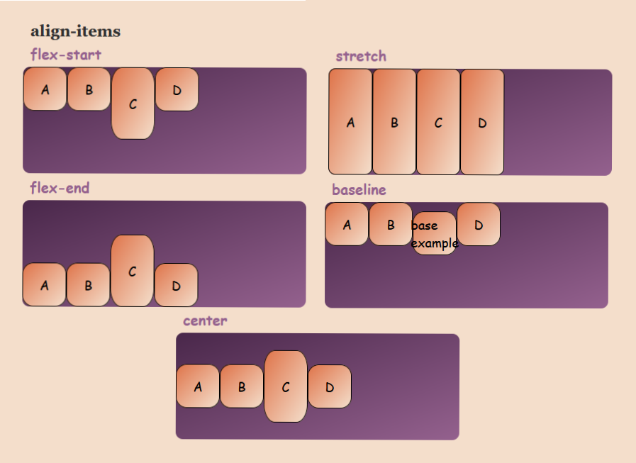
align-items: flex-start | flex-end | center | stretch | baseline;- align-items: flex-start – This aligns the flex-items at the top of the container
- align-items: flex-end – This aligns the flex-items at the bottom of the container
- align-items: center – This aligns the flex items at the center of the container leaving equal space at top and bottom for the flex-items
- align-items: stretch – This is the default value and fills the container vertically
- align-items: baseline – This aligns the content inside flex-items to the baseline
align-content:
This property is bit similar to the justify-content where justify-content aligns the items on the main-axis and align-content aligns the flex rows in the container
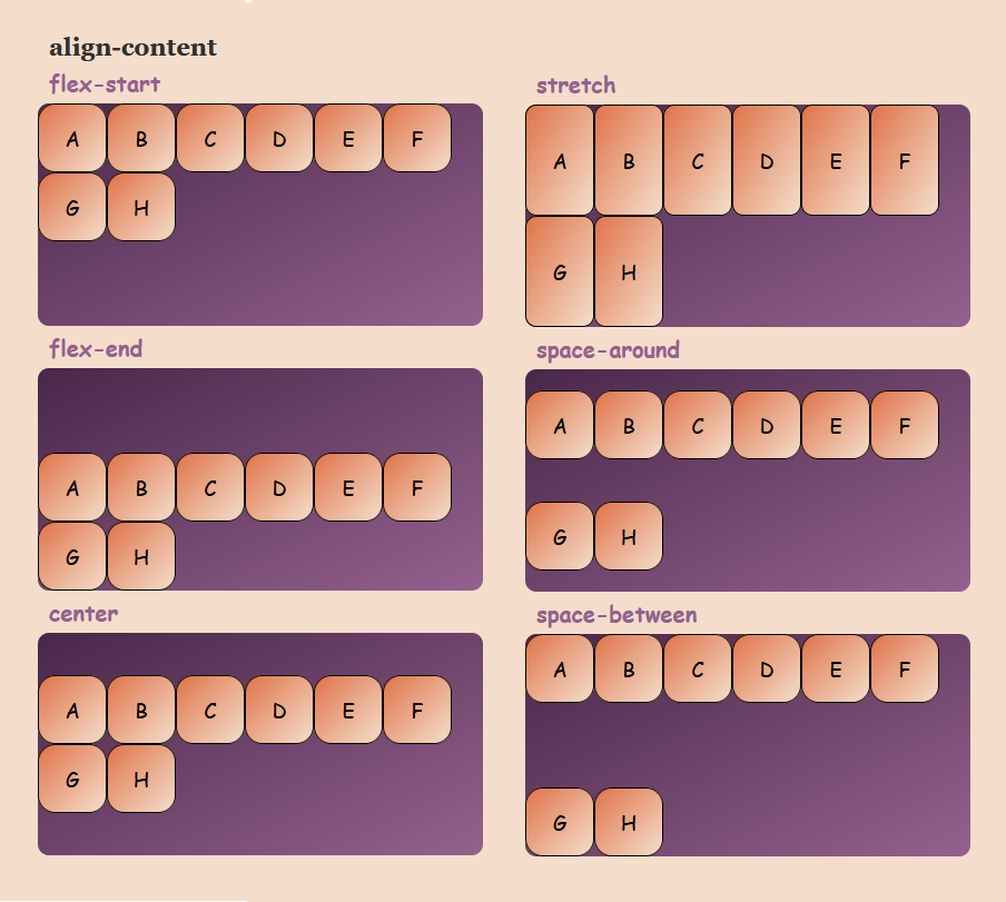
align-content: flex-start | flex-end | center | stretch | space-between | space-around;- align-content: flex-start – flex-items are packed and aligned at the top of the container
- align-content: flex-end – flex-items are packed and aligned at the bottom of the container
- align-content: center – flex-items are packed and aligned at the center of the container
- align-content: stretch – The items stretch up to fill all the space in the container
- align-content: space-between – There is equal space between the flex-items vertically where the first and last row of the container are at the edge of the container
- align-content: space-around – There is equal space between the flex-items as well as the first and last row with the edges of container
Note: This property only implies when the flex-wrap property is wrap or wrap-reverse
flex-wrap: wrap | wrap-reverse
flex-flow:
This is the bounce for the flex-container. It is the shorthand for the flex-direction and flex-wrap properties.
flex-flow: row nowrap | row wrap | column wrap | column nowrapFor example: flex-direction: column; flex-wrap: wrap; => flex-flow: column wrap
Where default is flex-flow: row nowrap
Following this guide, continue reading about Flex Items in the next blog: CSS Flexbox: Flex-Item