 By ByteBot
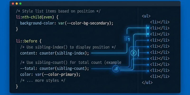
CSS has always known what you look like — color, size, font — but never where you stand. The new sibling-index() and sibling-count() functions change that. For the first time, CSS can see that an element is the third of seven siblings and calculate from that number directly. No JavaScript loop setting inline styles, no preprocessor generating fifty :nth-child() rules. Just CSS doing math about the DOM.
These functions shipped in Chrome 137+ and Safari 26.2. With Firefox implementation now underway as a formal Interop 2026 commitment, broad baseline support is imminent. Now is the right time to add these to your toolkit.
The Workaround Everyone Has Been Using
For years, staggered entrance animations required a JavaScript shim followed by a CSS property read:
document.querySelectorAll('.card').forEach((el, i) => {
  el.style.setProperty('--index', i);
});
.card {
animation-delay: calc(var(--index) * 120ms);
}It works. But it couples your styling to a script, breaks in SSR contexts where JavaScript hasn’t run yet, and needs updating every time the component’s logic changes. Two files for what should be a pure presentation concern.
How sibling-index() and sibling-count() Work
The critical distinction: these are values, not selectors. :nth-child() picks elements — it cannot produce a number for calc(). sibling-index() and sibling-count() return integers that live inside your declarations and participate in math expressions directly.
sibling-index()— returns the 1-based position of the element among its siblingssibling-count()— returns the total sibling count (including itself) under the same parent
Both take zero arguments and can be used anywhere an integer is valid in CSS: calc(), hsl(), translate(), animation-delay, and more. Full syntax and formal definitions are on MDN.
Pattern 1: Staggered Animations (No JavaScript)
Each card fires its entrance animation 120 milliseconds after the previous one, scaling automatically to any number of items:
.card {
  animation: fade-in 0.5s ease both;
  animation-delay: calc((sibling-index() - 1) * 120ms);
}
The - 1 ensures the first card starts at 0ms. Want the last item to animate first? Flip the direction:
.card {
  animation-delay: calc((sibling-count() - sibling-index()) * 80ms);
}
Five cards or five hundred — one rule handles all of them. No :nth-child(1) through :nth-child(50), no forEach loop, no inline styles.
Pattern 2: Progressive Color Without a Preprocessor
Assign each list item a unique hue slice by dividing the full color wheel by the sibling count:
li {
  background: hsl(
    calc(360deg / sibling-count() * (sibling-index() - 1))
    50% 55%
  );
}
Five items produces hues at 72-degree intervals. Ten items gives 36-degree gaps. The distribution stays even and automatic. This previously required a Sass @for loop or JavaScript setting CSS variables one by one. Now it’s four lines.
Bonus: Circular Layouts
Combine sibling-index() with CSS trigonometric functions to distribute elements radially:
.dot {
  --angle: calc(360deg / sibling-count() * sibling-index());
  --radius: 120px;
  position: absolute;
  left: calc(50% + cos(var(--angle)) * var(--radius));
  top:  calc(50% + sin(var(--angle)) * var(--radius));
  transform: translate(-50%, -50%);
}
Add or remove items — the layout self-corrects. This eliminates an entire category of runtime positioning scripts in data visualization and icon ring components.
Browser Support: Ship It Now With a Safety Net
Chrome 137+ and Safari 26.2 ship stable support today, covering roughly 75–80% of global browser traffic. Firefox is in active implementation under Interop 2026. The right strategy is progressive enhancement, not waiting:
/* Fallback: base animation, no stagger */
.card { animation: fade-in 0.5s ease both; }

/* Stagger where supported */
@supports (animation-delay: calc(sibling-index() * 1ms)) {
  .card {
    animation-delay: calc((sibling-index() - 1) * 120ms);
  }
}
Unsupported browsers see everything animate simultaneously — a valid, non-broken experience. Check Can I Use for current figures before shipping to production.
One Gotcha: Shadow DOM Isolation
If you reach into a web component through ::part() and use sibling-index(), the browser returns 0. This is intentional — a deliberate security boundary preventing external CSS from probing a shadow DOM component’s internal structure. It is not a bug. Also: ::before and ::after are not counted as siblings, but you can use these functions inside pseudo-element declarations, where they evaluate against the originating element.
Use It Now
Don’t wait for full Baseline. @supports detection is reliable, the fallback is trivial, and the enhancement is meaningful — especially for animations, where graceful degradation means “everything plays at once” rather than “the layout breaks.” The Smashing Magazine deep-dive from May 2026 is the comprehensive reference for advanced patterns. Interop 2026 is the browser community’s promise that Firefox won’t lag far behind. CSS is positionally aware now. Ship it.