 By Mithil Jain
This article on Flexbox: flex-item is the continuation of the CSS flexbox – Flex Container. In case you have not read the Flexbox Container article, kindly refer to that before continuing.
Following the previous article, Flexbox module consists of 2 parts: Container and Items. The previous article covered containers. Similarly, in this article we will learn about the properties of flex-items.
So, considering that you know about flex module and container, let’s dive into the different properties of the flexbox items.
Properties of CSS Flexbox: flex-item (child component)
List of properties for flex-item
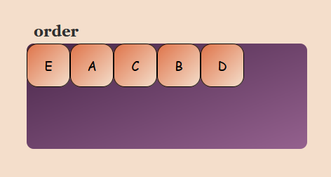
order:
By default, all the items inside the flex container are displayed in the source order. The default value for each flex item the order is 0, but we can change the layout order using the order property.
order: <number>;flex-grow:
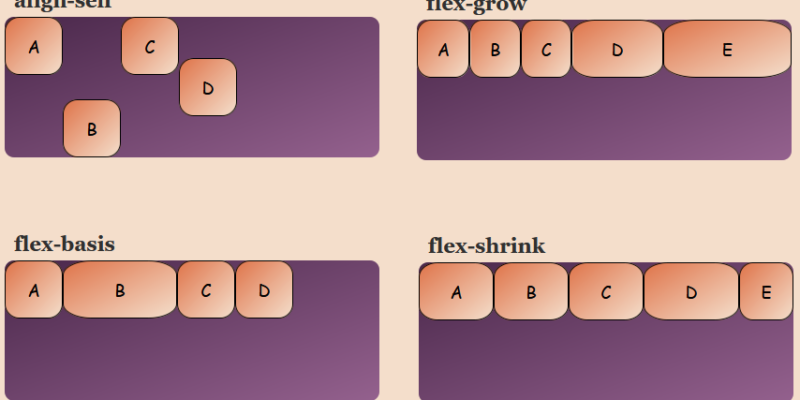
This property specifies how a flex-item should grow concerning the other items in the container. The flex-grow property allows particular items to increase width according to the needs.
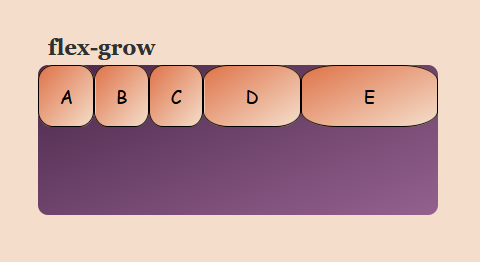
Considering an example that 5 (A, B, C, D, E) items are there in the container and 3 (A, B, C) of them are set with flex-grow: 1, so now if the other 1 (D) is set as flex-grow: 2 then the size of D will be twice the size of the A. and E as flex-grow: 3 the E will be thrice the size of A
flex-grow: <number>;flex-shrink:
This property specifies how a flex item will shrink concerning the other items in the container. flex-shrink is used when flex-wrap is set to nowrap. In such condition, if any item is set to flex-shrink: 0 then that item will not shrink as compared to the other items in the container
The default value for flex-shrink is 1
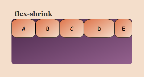
Considering an example that 5 (A, B, C, D, E) items are there in the container and 3 (A, B, C) of them are set with flex-shrink: 1 (default), So now if the other 1 (D) is set as flex-shrink: 0 then the size of D won’t shrink and if E as flex-shrink: 2 then E will shrink thrice the size of A
flex-shrink: <number>;flex-basis:
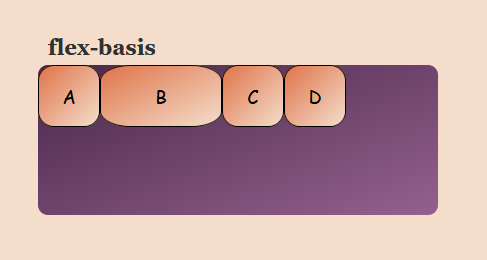
This property defines the initial/default value of a flex-item where it can be in px, em, %, etc. flex-basis is used when we don’t want a particular item to change its width in flex-container
flex-basis: <width>;align-self:
This property aligns a particular item in the flex container. It takes the same values as align-items and it also overwrites the value of the align-items property
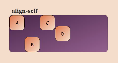
align-self: flex-start | flex-end | center | baseline | stretch;flex:
This is the shorthand for flex-grow, flex-shrink, and flex-basis same as flex-flow which is shorthand for flex-direction and flex-wrap. flex: <flex-grow> <flex-shrink> <flex-basis> and with default value as the default of the individual property