Posit released ggsql alpha today—a SQL extension that embeds data visualization directly into SQL queries. Led by Hadley Wickham (creator of ggplot2), the tool brings Grammar of Graphics principles to SQL with VISUALIZE and DRAW clauses. SQL analysts can now write queries that return charts, not just data, without switching to Python or R.
SQL is the universal language of data work—the only language shared by analysts, engineers, and scientists. Yet visualization has always required exporting data to ggplot2, matplotlib, or BI tools. ggsql eliminates that context switch. For SQL specialists, LLM analytics agents, and DuckDB users, this is a native visualization path.
How ggsql Works: VISUALIZE + DRAW in SQL
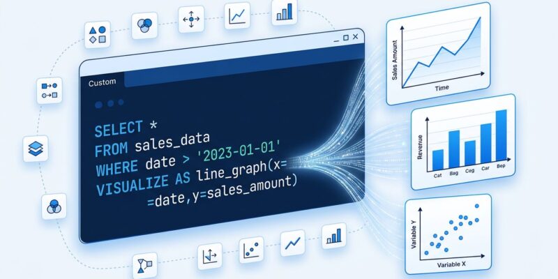
ggsql extends SQL with two new clauses. VISUALIZE maps data columns to visual aesthetics—x position, y position, color, size. DRAW specifies the geometry type: point, line, bar. Queries compile to Vega-Lite specifications for rendering. Written in Rust for performance, it supports DuckDB and SQLite backends.
Basic syntax looks like this:
VISUALIZE bill_len AS x, bill_dep AS y, species AS color
FROM ggsql:penguins
DRAW point
Three lines: data, aesthetics, geometry. No matplotlib imports, no ggplot2 environment, no separate charting library. The query retrieves data and defines visualization in one operation.
Full queries integrate standard SQL with visualization clauses:
SELECT date, revenue, region FROM sales WHERE year = 2024
VISUALISE date AS x, revenue AS y, region AS color
DRAW line
SCALE x SETTING breaks => 'month'
LABEL title => 'Sales by Region'
This works in Jupyter notebooks, Quarto documents, VS Code, and Positron. Write SQL, get charts. LLM agents like ChatGPT and Claude can generate these queries—the syntax is explicit enough for reliable code generation.
SQL’s Visualization Gap (Finally Addressed)
The traditional workflow is broken. Analysts write SQL, export to CSV, import to Python, write visualization code, then render. Four steps, two languages, constant context-switching. Hacker News users noted it immediately: “SQL is the only shared language across data roles, making a SQL-based visualization interface uniquely practical.”
BI tools like Tableau and Looker solve this, but they cost $5-10K per month and lock teams into proprietary platforms. Mode Analytics offers SQL + viz, but requires Python or R for custom charts. ggsql is open source, lightweight, and SQL-native.
This fits a broader SQL centralization trend. DuckDB, BigQuery, and Snowflake are doing more computation in SQL rather than external scripts. ggsql extends that philosophy to visualization. Why export data when you can visualize it where it lives?
Hadley Wickham Brings Grammar of Graphics to SQL
ggsql comes from Posit’s data visualization team: Hadley Wickham (ggplot2 creator), Thomas Lin Pedersen, Teun Van den Brand, and George Stagg. This isn’t a random experiment—it’s data viz royalty applying 25 years of proven design to SQL.
Grammar of Graphics was invented by statistician Leland Wilkinson in 1999. Wickham implemented it as ggplot2 in 2005, which became one of R’s most popular packages. The core idea: treat visualizations as compositions of data, aesthetics, geometries, and scales. No predefined chart types—just modular components that combine infinitely.
ggsql brings those principles to SQL. The VISUALIZE clause handles aesthetics, DRAW handles geometries. The composable layer approach remains intact. It’s ggplot2’s proven design, translated to SQL syntax.
Alpha Status: What Works, What’s Missing
ggsql is alpha-stage—core functionality works, but it’s not feature-complete. Current support: DuckDB and SQLite only. No BigQuery, Postgres, or Redshift yet. Output format: Vega-Lite exclusively. Missing features include PDF/SVG export (critical for reports) and production deployment guides.
Hacker News reaction is mixed. LLM developers see value: “SQL-based visualization definitions work well for agentic analytics due to auditability and reproducibility.” But a former Uber engineer who built similar tooling warned the approach “may prove more or less useless”—pull-and-visualize workflows rarely deliver in production.
The GitHub repo shows modest traction: 127 stars, 7 forks as of April 2026. The roadmap includes expanding database readers (community wants BigQuery and Postgres), adding a high-performance Rust writer, and improving documentation. The official blog post confirms this won’t compete with ggplot2’s full feature set—it serves different use cases.
Use ggsql for prototyping in Jupyter notebooks, quick analytics in DuckDB, or LLM-powered analytics agents. Don’t use it for production BI dashboards or complex custom visualizations. Yet. The alpha designation is accurate—promising foundation, incomplete feature set.
Key Takeaways
- ggsql embeds visualization in SQL queries via VISUALIZE and DRAW clauses—no Python/R context switch required
- Built by Hadley Wickham’s team at Posit, bringing 25 years of Grammar of Graphics design to SQL
- Alpha stage: works in Jupyter, Quarto, VS Code, and Positron with DuckDB/SQLite support, outputs Vega-Lite
- Best for SQL specialists, LLM analytics agents, and DuckDB users—not ready for production BI or ggplot2 power users
- Fits the SQL centralization trend: DuckDB, BigQuery, and Snowflake are doing more in SQL, now including visualization